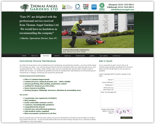
Web Design for SOS Computer
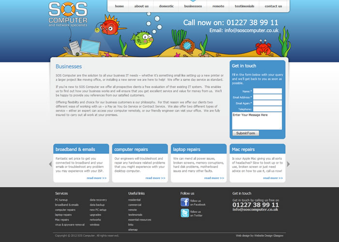
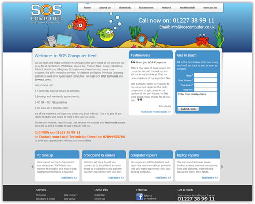
The design for the new SOS Computer website centred around the fantastic illustration work of Karen Morrison which had been used for offline promotional material. We decided that it should be a key feature and designed a fairly corporate website around it to come up with this crossover concept which the client loved.
The site is built around a robust CMS platform to give the client full control over the content. We look forwards to taking this site forwards with phase 2 already in the planning so watch this space.


